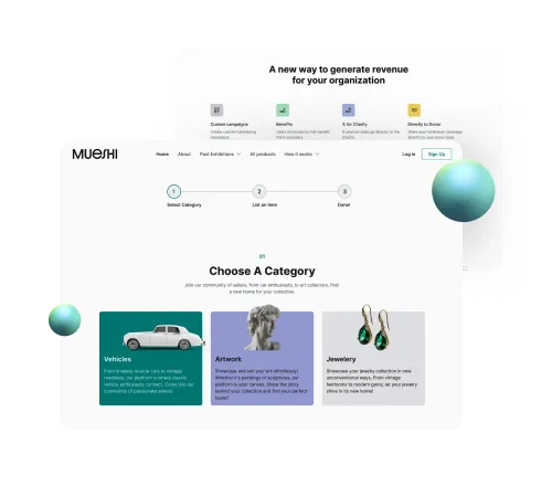
Join us on a creative ride and learn how we reinvented Mueshi's fundraising platform.


Our Design Arsenal:
• UX/UI
• Figma
• Photoshop
• RWD


Challange Accepted
Our mission? To echo Mueshi's innovative spirit in their digital presence. We set out to craft a user experience that was not just functional but a delight to their diverse community of art lovers and philanthropists.
Our Creative Process
Getting the Vibes Right:
It all started with understanding Mueshi's heartbeat - their vision, their audience, and the impact they wanted.
Designing with Purpose:
Through regular, coffee-fueled brainstorming sessions, we pieced together a design that was more than pixels - it was Mueshi's story.
Iterative Magic:
We believe in evolution, not revolution. So, we refined, tweaked, and polished, keeping Mueshi in the loop every step of the way.


Our Solutions
Style Guide that Speaks Mueshi:
We didn’t just pick colors and fonts; we crafted a visual language that screams Mueshi's identity.
UX Audit, Not Just a Check-Up:
This was a deep dive into Mueshi's world to spot opportunities to amaze their users.
Website Redesign - Where Art Meets Heart:
More than a makeover, we sculpted a digital space where visitors feel the essence of Mueshi.
Redefining the Auction Journey:
Bidding, buying, and falling in love with art and charity has never been easier or more fun.
Responsive Design for All Screens:
Because great experiences don’t play favorites with devices.
Business Model Like No Other:
Users of all ages, including seniors, are not just visiting; they're staying, exploring, and engaging more than ever, thanks to our inclusive approach.
Conversions? Skyrocketing:
Our light-mode-centric redesigned landing page now serves as a welcoming gateway, where visitors of every age can comfortably embark on their Mueshi journey.
Auction Flows Smooth as Silk:
Bidding in our auctions, now focused more on charity and luxury goods, feels like a breeze, receiving glowing feedback from a diverse audience.
Comfort for All Ages:
Our platform, consistently in light mode, offers comfort and accessibility, making it a hit among users of all ages who seek a less strenuous visual experience.
Seamless Across Devices: Mueshi's platform shines on any screen, thanks to our responsive design finesse, attracting a wide demographic with its focus on luxury goods and charitable causes.


